/machine-learning/bootcamp/07-pandas-data-visualization/07-pandas-data-visualization.md
Machine Learning Udemy Bootcamp 06 - Pandas data visualization
Pandas has some built-in data-visualization tool that allows to easily display dataframe plots based on the dataframe itself or one of its features.
It's possible to choose if draw plots using matplotlib, seaborn or pandas built-in.
Plotting with Pandas
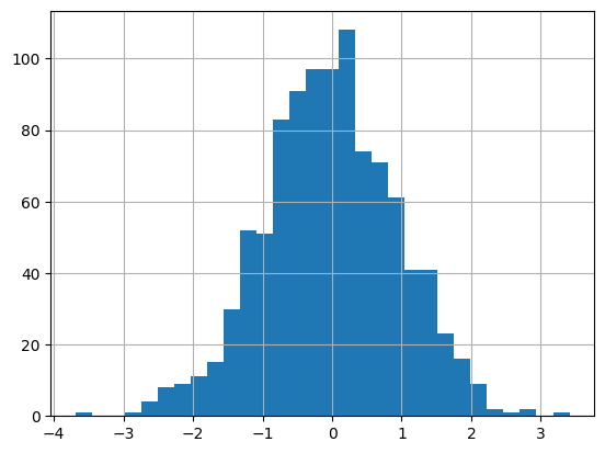
A simple plot:
df1['A'].hist(bins=30)
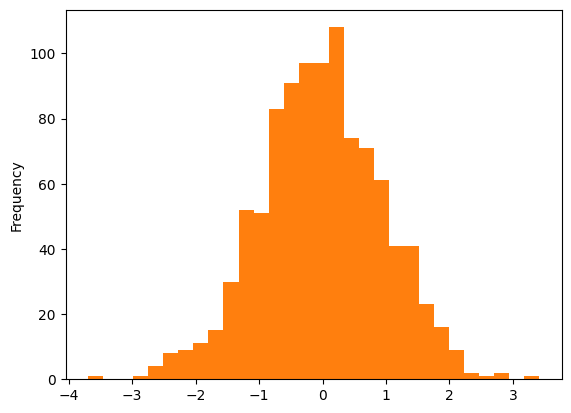
It's possible to choose what kind of syntax to use:
# df columns expose plot method
df1['A'].plot(
    # what kind of plot
    kind='hist',
    bins=30
)
# shorthand
df1['A'].plot.hist(bins=30)
AREA PLOT
df2.plot.area(
    # transparency
    alpha=0.4
)
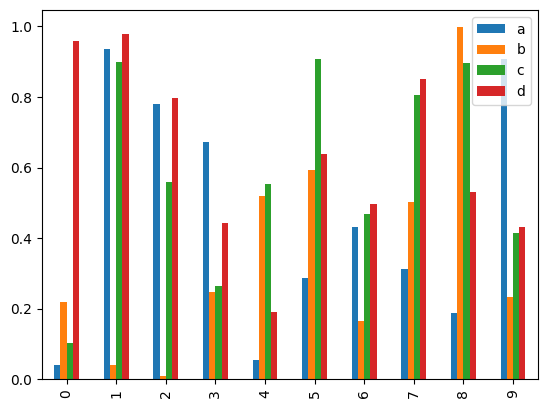
BAR PLOT
# considers categorical indexes, if number they will be treated as categories
df2.plot.bar()
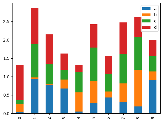
# onlw shows the offset between bars
df2.plot.bar(stacked=True)
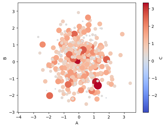
SCATTER PLOT
df1.plot.scatter(
    # feature A on x axis
    x='A',
    # feature B on y axis
    y='B',
    # color based on feature C, adds 3rd dimension
    c='C',
    # adjust size of dots based on feature C
    s=df1['C'] * 100,
    cmap='coolwarm'
)
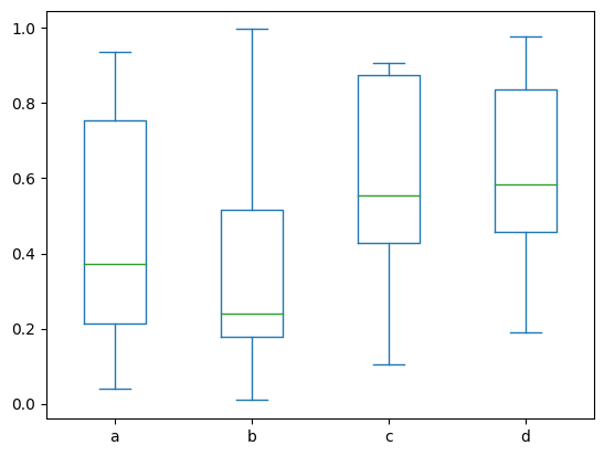
BOX PLOT
df2.plot.box()
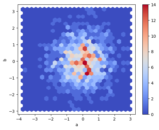
HEXBIN PLOT
df = pd.DataFrame(np.random.randn(1000, 2), columns=['a', 'b'])
df.plot.hexbin(x='a', y='b', gridsize=25, cmap='coolwarm')
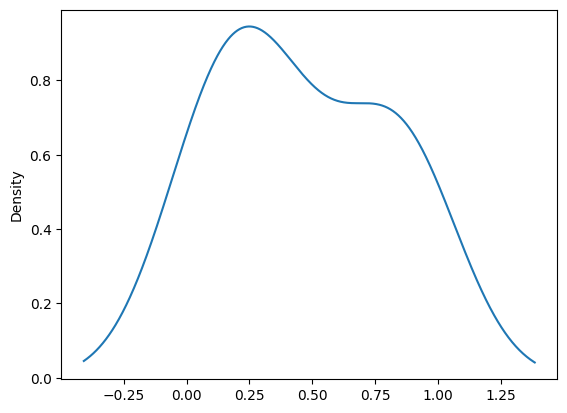
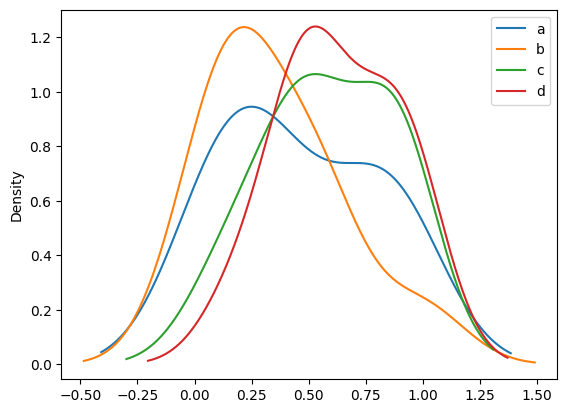
KDE PLOT (Kernel Density Estimation)
df2['a'].plot.kde()
DENSITY PLOT
df2.plot.density()
Git
GO
GitGOmachine-learningpandasseaborngithubudemymatplotlibnplmdstorage