Machine Learning Udemy Bootcamp 06 - Seaborn
Seaborn is a statistical plotting library, built on top of matplotlib.
It's designed to work well with pandas dataframe objects.
It's open source and hosted on Github.
conda install seaborn
pip install seaborn
Distribution Plots
Distribution plots allows to show the distribution of a univariate (one variable) set of observations.
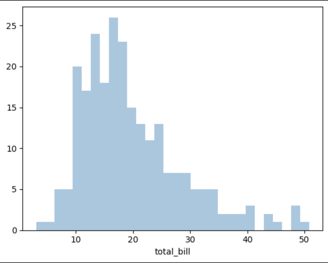
DISTPLOT
Distplot is a histogram with a line on it representing the distribution.
import seaborn as sns

# allow visualization in Jupyter Notebook
%matplotlib inline

tips = sns.load_dataset('tips')

tips.head()

# distribution plot
sns.distplot(
    tips['total_bill'],
    # remove kde line and display only histogram
    kde=False,
    # change number of bins
    bins=30
)
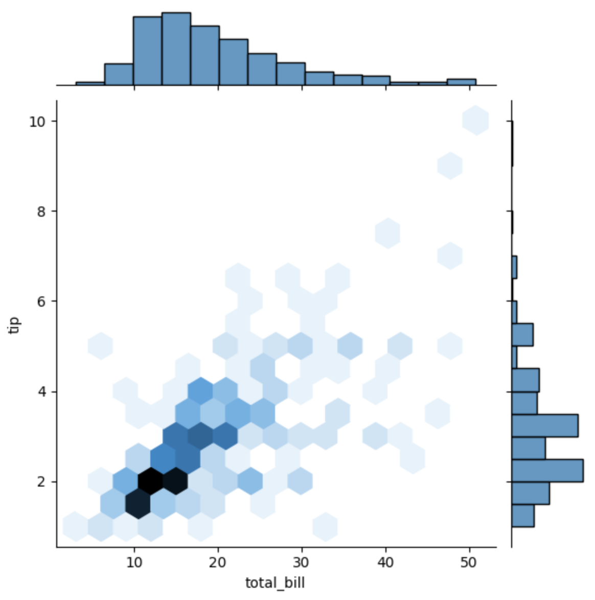
JOINTPLOT
Jointplot allows to match up two distplots for bivariate data (two variables).
It creates a canvas where are related two distplots.
sns.jointplot(
    # feature on X
    x='total_bill',
    # feature on Y
    y='tip',
    # dataset where to extract features
    data=tips,
    # hex => hexagonal density plot
    # ref => linear regression visualizer
    # kde => kernel density estimation
    # how data is represented
    kind='scatter'
)
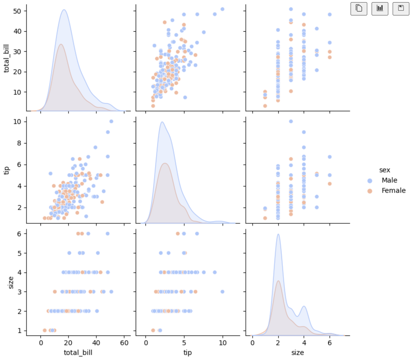
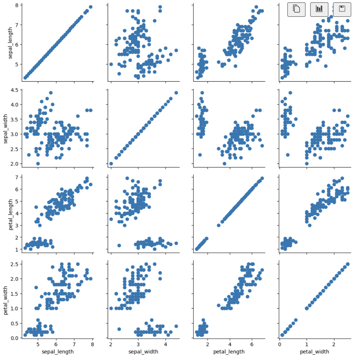
PAIRPLOT
Pairplot allows to plot pairwise relationships across an entire dataframe (for the numerical columns) and supports a color hue argument (for categorical columns).
It's a jointplot for every single combination of the numerical columns in the dataframe.
sns.pairplot(
    # dataset to visualize
    tips,
    # categorical columns
    hue='sex',
    # pass a predefined palette from seaborn website
    palette='coolwarm'
)
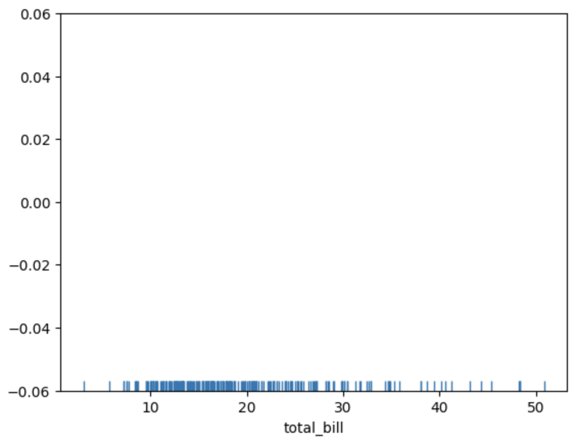
RUGPLOT
Rugplot draws a dash mark for every point on a univariate distribution.
sns.rugplot(
    tips['total_bill']
)
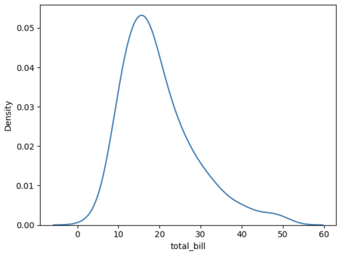
KDEPLOT
KDEPlot represents the distribution of data in a KDE (Kernel Density Estimation) format.
Normal distribution is mathematically represented by KDE.
sns.kdeplot(
    tips['total_bill']
)
Categorical Plots
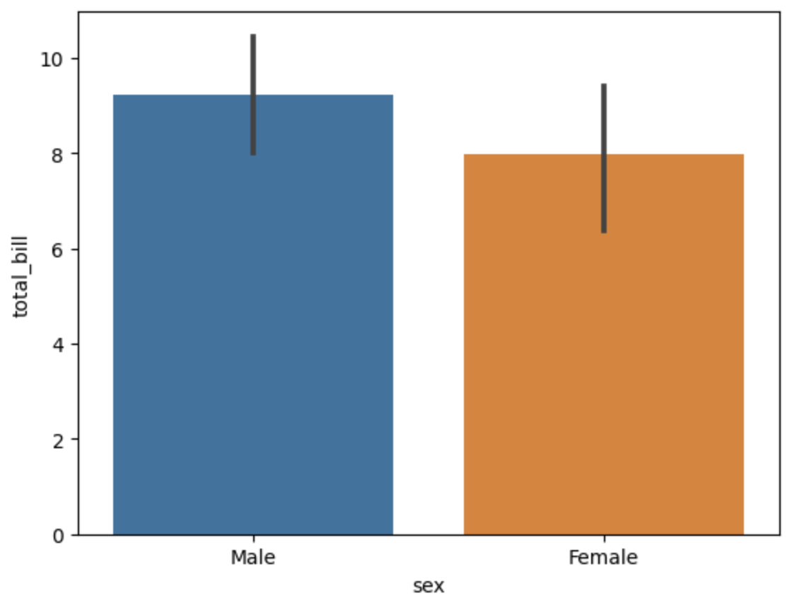
BARPLOT
Barplot is a general plot that allows to aggregate categorical data based off some function, by default the mean.
sns.barplot(
    # feature sex on X (categorical)
    x='sex',
    # feature total_bill on Y (numerical)
    y='total_bill',
    data=tips
)
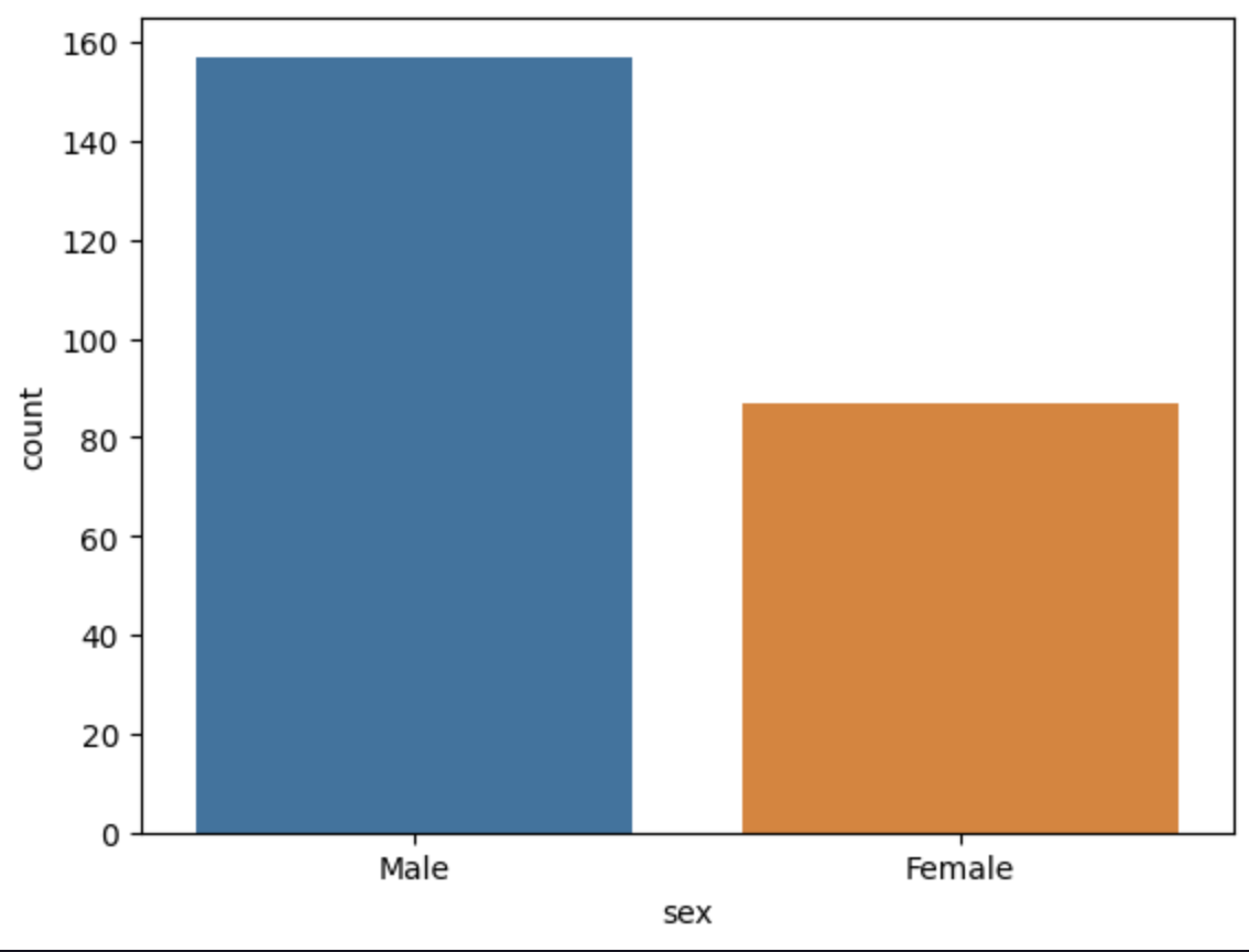
COUNTPLOT
Countplot is the same as barplot except the estimator is explicitly counting the number of occurrences.
sns.countplot(
    # categorical feature
    x='sex',
    data=tips
)
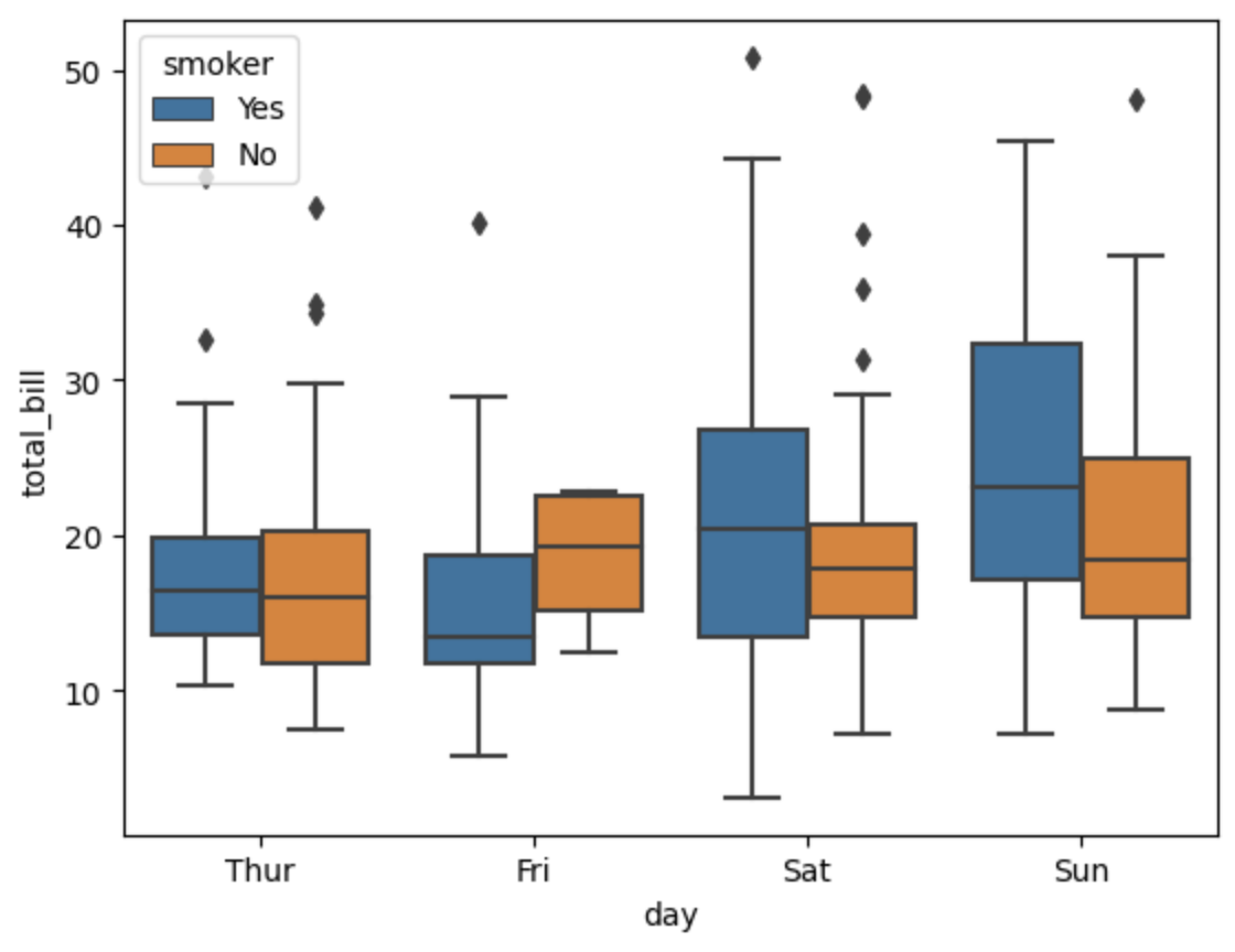
BOXPLOT
Boxplot shows the distribution of categorical data.
It shows the quartiles of the dataset while the whiskers extend to show the rest of the distribution.
Outliers are plotted as points outside the whiskers.
sns.boxplot(
    # categorical feature
    x='day',
    # numerical feature
    y='total_bill',
    data=tips,
    # categorical feature
    hue='smoker'
)
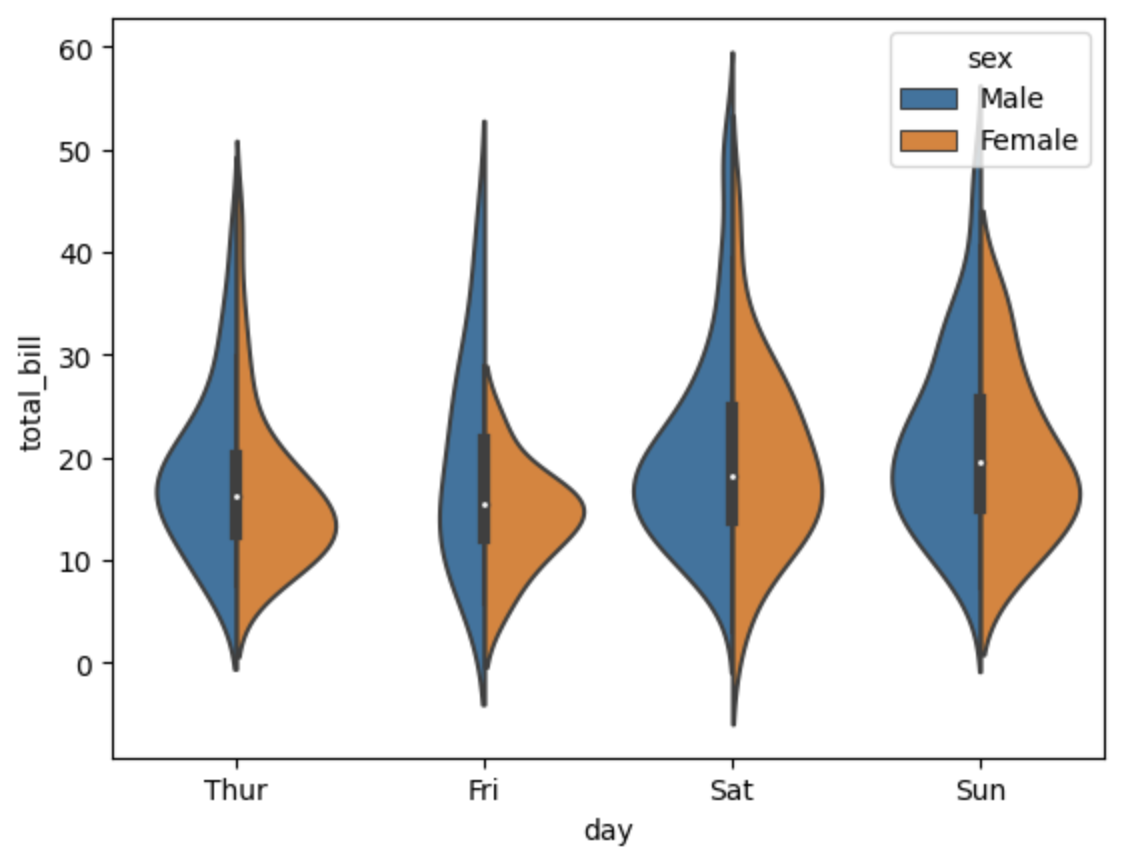
VIOLINPLOT
Violinplot plays a combination of boxplot and kdeplot.
Allows to understand the relationship between two categorical features and a numerical feature.
sns.violinplot(
    # categorical feature
    x='day',
    # numerical feature
    y='total_bill',
    data=tips,
    hue='sex',
    # split the violin plot by the hue feature
    # instead of having a violin plot for each category of the hue feature
    split=True
)
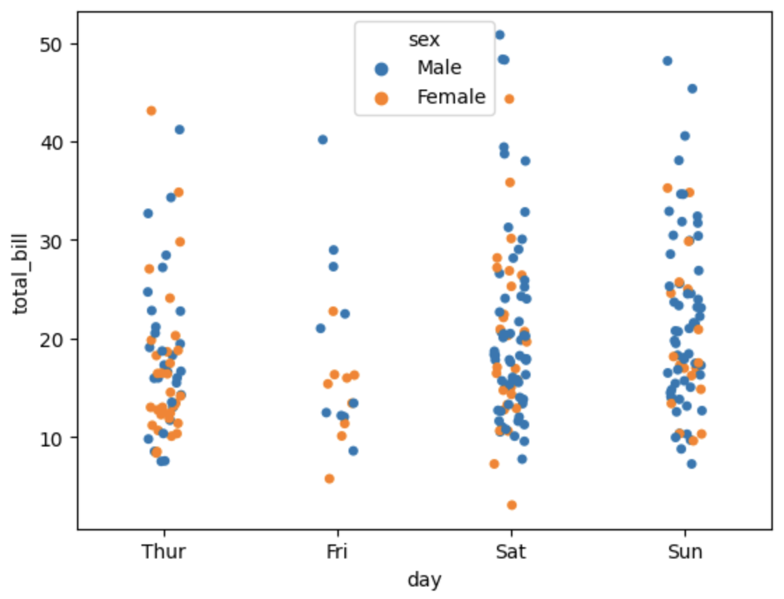
STRIPPLOT
Stripplot draws a scatterplot where one variable is categorical.
A strip plot can be drawn on its own, but it is also a good complement to a box or violin plot in cases where you want to show all observations along with some representation of the underlying distribution.
sns.stripplot(
    # categorical feature
    x='day',
    # numerical feature
    y='total_bill',
    data=tips,
    # adds a random noise to the data to avoid overlapping
    jitter=True,
    hue='sex'
)
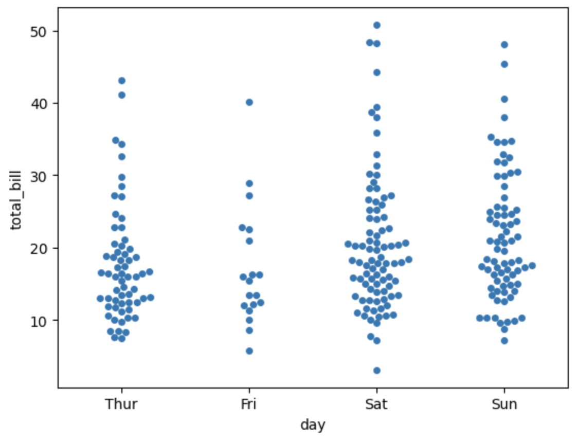
SWARMPLOT
Swarmplot is a combination of stripplot and violinplot, but the points are adjusted (only along the categorical axis) so that they don’t overlap.
This gives a better representation of the distribution of values, although it does not scale as well to large numbers of observations (both in terms of the ability to show all the points and in terms of the computation needed to arrange them).
sns.swarmplot(
    x='day',
    y='total_bill',
    data=tips,
)
FACTORPLOT
Factorplot is the most general form of a categorical plot.
It can take in a kind parameter to adjust the plot type.
sns.factorplot(
    x='day',
    y='total_bill',
    data=tips,
    # specify the kind of plot
    kind='bar'
)
Matrix Plots
Matrix plots allow to plot data as color-encoded matrices and can also be used to indicate clusters within the data.
To be a Marix it should have categorical features on both axes.
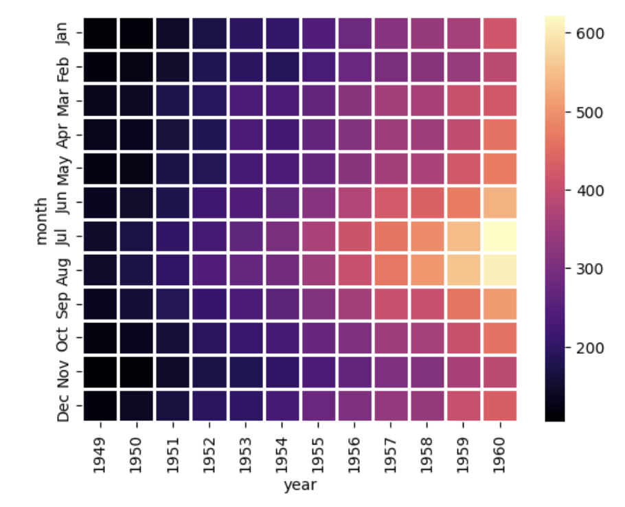
HEATMAP
Heatmap is a simple way to plot a matrix plot.
sns.heatmap(
    # dataset to plot
    flights,
    # annotates the heatmap with the numeric value
    annot=True,
    # cmap => colormap
    cmap='coolwarm'
)
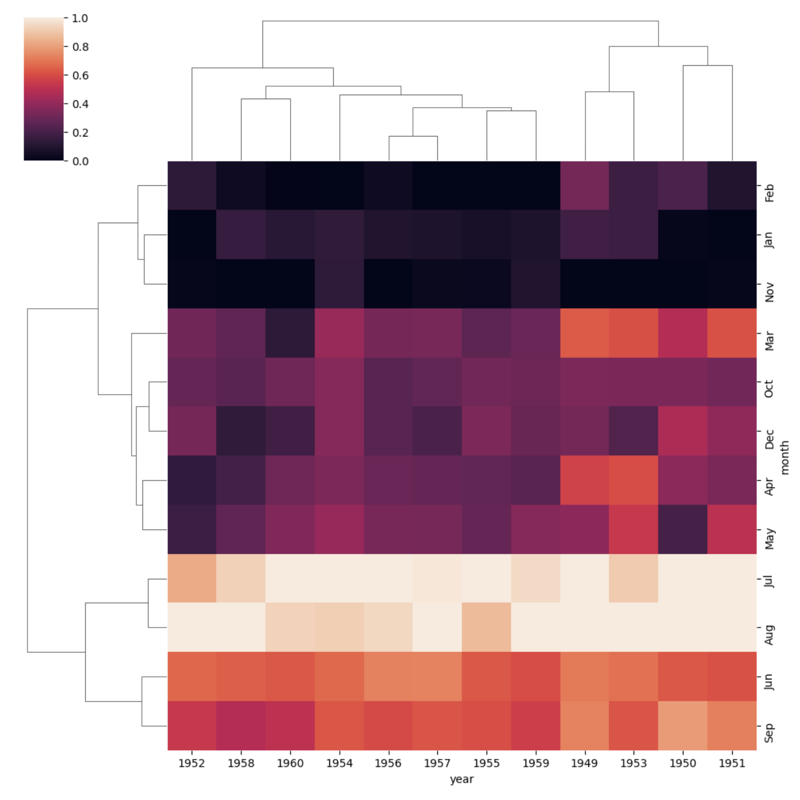
CLUSTERMAP
Clustermap uses hierarchal clustering to produce a clustered version of the heatmap.
It will show data aggregated as similar values, heatmap uses the provided order to show the data
sns.clustermap(
    flights,
    # standardize the scale
    standard_scale=1
)
Grids
Grids are general types of plots that allow you to map plot types to rows and columns of a grid, this helps you create similar plots separated by features.
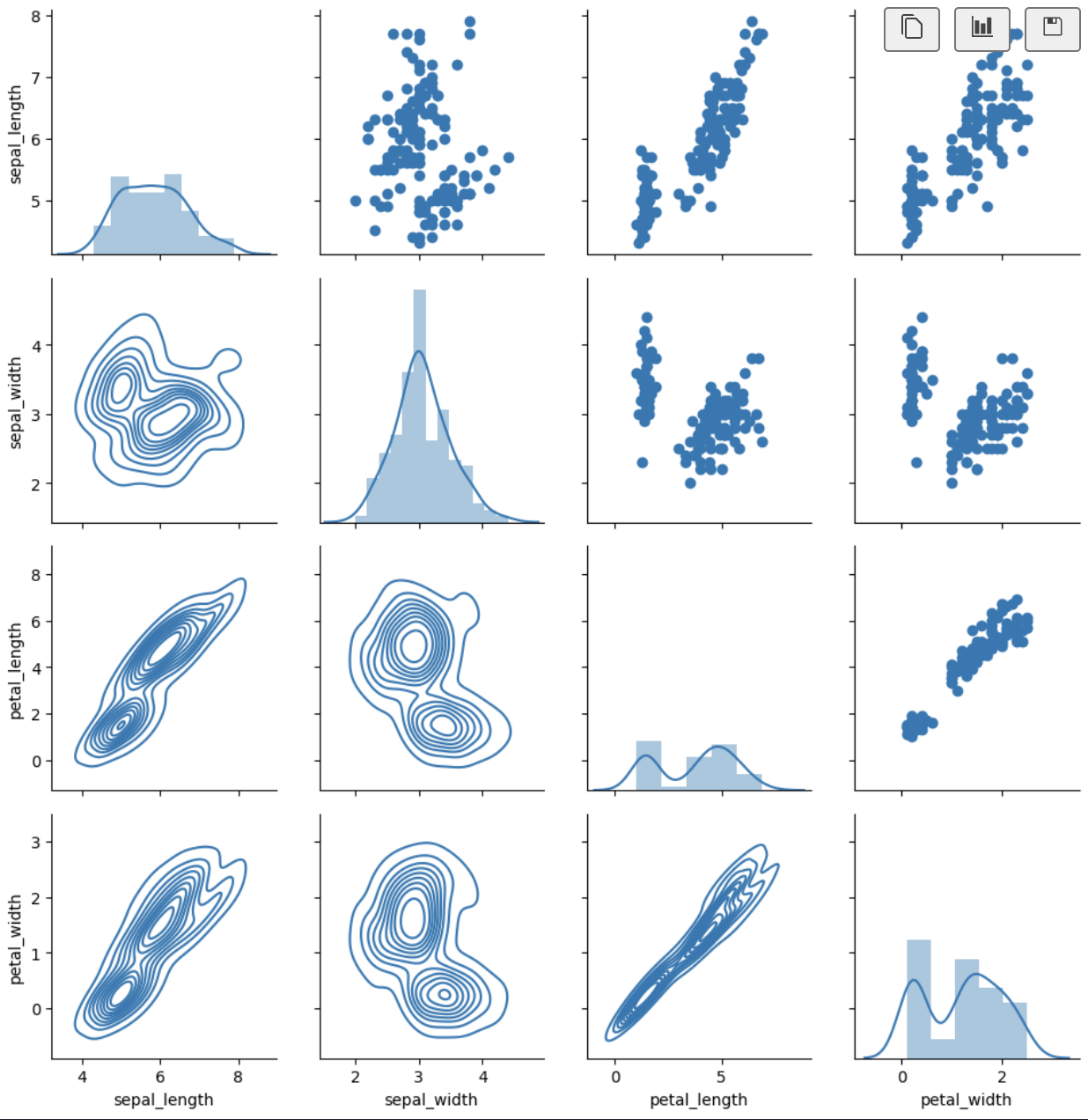
PAIRGRID
Pairgrid is a subplot grid for plotting pairwise relationships in a dataset.
It's how pairplot is implemented, it allows to create a grid of custom plots
Scatterplot:
from matplotlib import pyplot as plt
iris = sns.load_dataset('iris')
g = sns.PairGrid(iris)
# apply scatterplot to the grid
g.map(plt.scatter)
Multiplot:
g = sns.PairGrid(iris)
# apply distplot to diagonal plots
g.map_diag(sns.distplot)
# apply scatterplot to the upper plots
g.map_upper(plt.scatter)
# apply kdeplot to the lower plots
g.map_lower(sns.kdeplot)
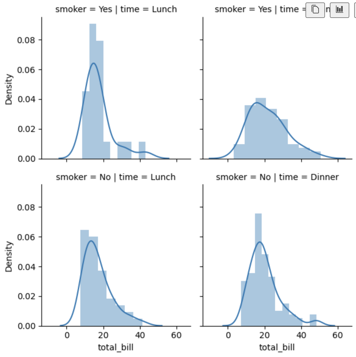
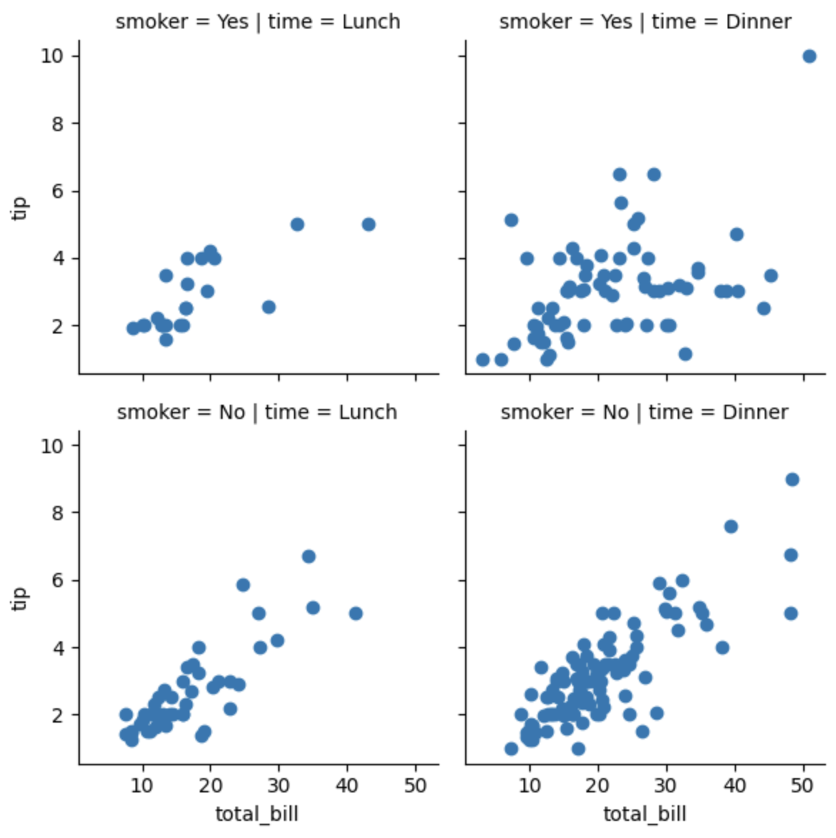
FACETGRID
Facetgrid is the general way to create grids of plots based off of a feature.
1 parameter distplot:
tips = sns.load_dataset('tips')
g = sns.FacetGrid(
    # data to use
    data=tips,
    # categorical feature to split the data
    col='time',
    # categorical feature to split the data
    row='smoker'
)
# apply distplot to the grid using the feature total_bill
g.map(sns.distplot, 'total_bill')
2 parameters scatterplot:
g = sns.FacetGrid(
    # data to use
    data=tips,
    # categorical feature to split the data
    col='time',
    # categorical feature to split the data
    row='smoker'
)
# apply distplot to the grid using the feature total_bill
g.map(plt.scatter, 'total_bill', 'tip')
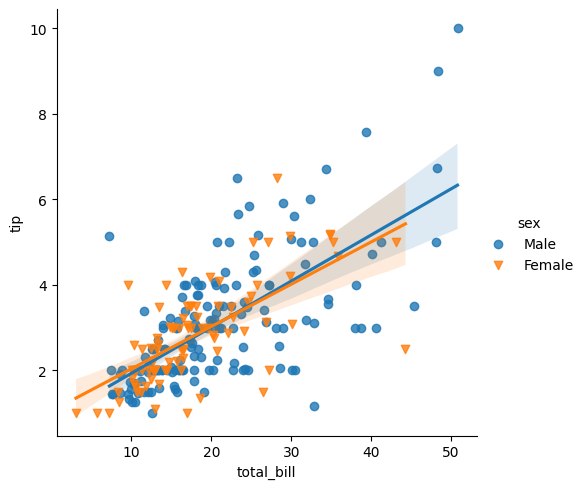
Regression Plots
Regression plots are plots that allow you to create a linear fit between two features.
LMPLOT
import seaborn as sns
tips = sns.load_dataset('tips')
# features separated by hue (color)
sns.lmplot(
    x='total_bill',
    y='tip',
    data=tips,
    hue='sex',
    markers=['o', 'v'],
)
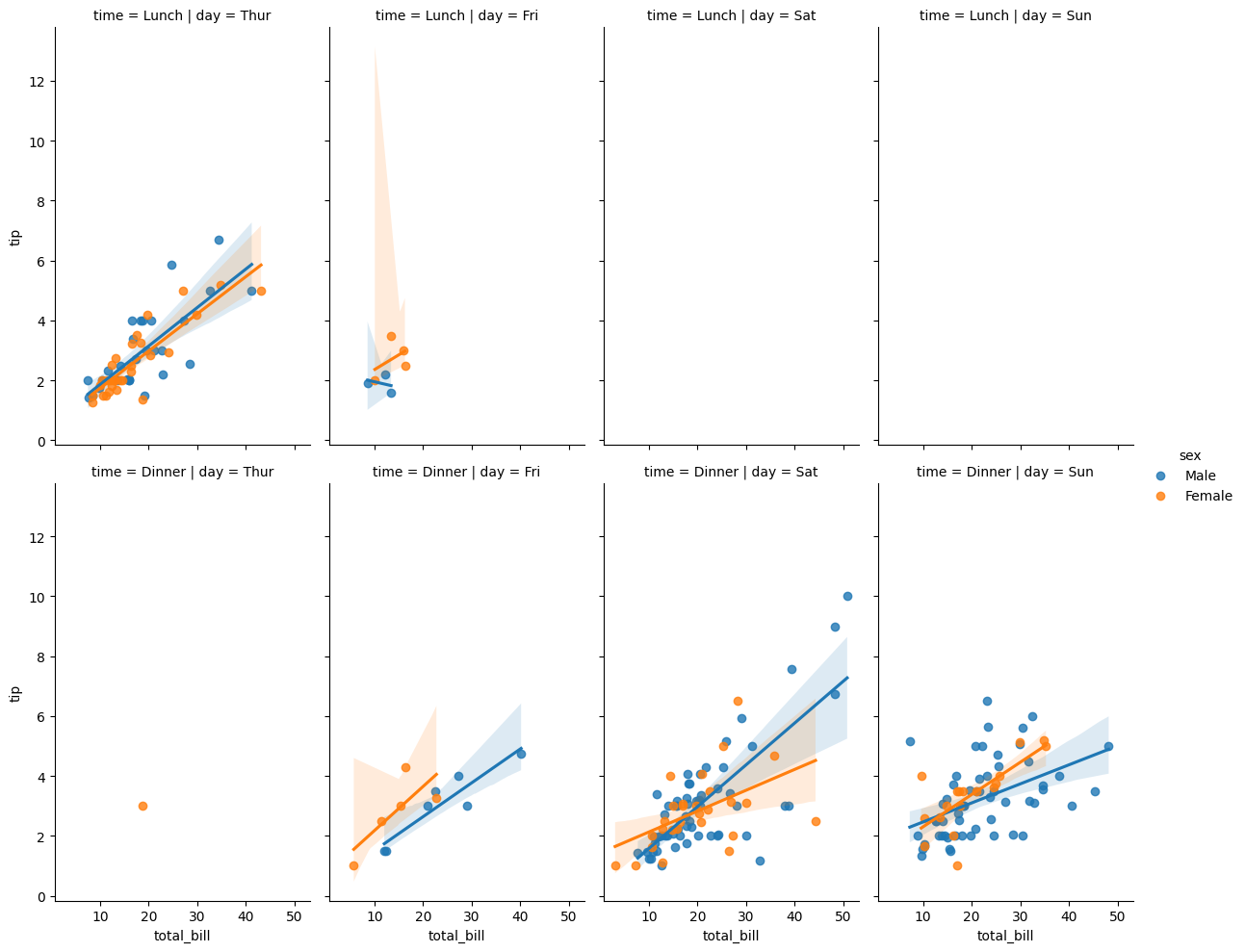
Using different features:
sns.lmplot(
    x='total_bill',
    y='tip',
    data=tips,
    col='day',
    row='time',
    hue='sex',
    aspect=0.6,
)
Styles
Seaborn provides a variety of styles to customize the plots:
import matplotlib.pyplot as plt

# overwrites the default seaborn styles
sns.set_context(
    # paper, notebook, talk, poster
    'poster',
    # font size of the labels
    # font_scale=3
)

# Change the size of the splot using core matplotlib
# It's possible to use matplotlib in combination with seaborn
plt.figure(figsize=(12,3))

sns.set_style(
    # ticks at the edge of the plot
    'ticks'
    # 'darkgrid'
    # 'whitegrid'
)
sns.countplot(x='sex',data=tips)
# remove the top and right spines
sns.despine(top=True, bottom=True)
Using plots parameters is possible to customize the plots even more:
sns.lmplot(
    x='total_bill',
    y='tip',
    data=tips,
    # distribute colors based on a categorical feature
    hue='sex',
    # preset of palettes provided by colormap docs of matplotlib
    palette='seismic'
)